"
This website need an intro page that warns
people about seizures ..."
people about seizures ..."
Welcome back to iNNC!UnACCEPTABLE on this second edition. Today,
we are going to look at some exemplary horrendous websites.
we are going to look at some exemplary horrendous websites.
Let's start with The Evangel Cathedral website. The website seem pretty cool at first,
but then you ask yourself: How do I get out of here? The reason this website gets annoying
60 seconds after you visit it on it's homepage, at least, is because all this voice over, music, and video should NOT be on a homepage of any website. It doesn't mean it's a bad idea.
It just means this content should not be on a homepage. This content is meant to be
on an "intro page." A page that really has no content other than a video of some sort, or music.
Also, an intro page MUST have a "skip" button so if your visitors get annoyed by it,
they can simply skip it and move on to the main website. Web designers are not always to blame for such sins as http://www.evangelcathedral.net/welcome.htm Designers, even though they advise their clients of the dos and don'ts of design, in the end,
are employed by the sometimes stubborn clients, and thus, have to do what those clients
want, if the designer wants to keep on eating and living and working for stubborn clients.
The Evangel Cathedral website gets a . . . 4/10
Now let's move on to this website that surprisingly. . . also sucks! This website
has recently been redesigned and improved, yet it is still not quite up to
eye candy status. Here is a pic of the before
has recently been redesigned and improved, yet it is still not quite up to
eye candy status. Here is a pic of the before
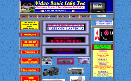

Now here's a pic of what the still awful website looks like today
First of all, what is up with the logo? Besides this musical instrument producing sound,
it has nothing to do with this business. This company needs a new identity pronto.
The changing images and descriptions are a good feature, but the images themselves
are really bad. And this merits starting a sentence with an "and," what in the love
of Twix bars is up with that website banner? J*** C****. I can honestly and easily say,
that is THE WORST website banner I have seen this year. In the end, I believe what
makes this website really look worse than it really is, is the color scheme.
If anyone involved with this site or you want to pitch a job to the owners of this business,
color scheme is the thing that can make this an easy fix.
http://www.videosoniclab.com/
Video Sonic gets a . . . 6/10
We spoke earlier about intro pages. Here is a website that NEEDS an intro page
with a video warning. Seriously. This website need an intro page that warns
people about seizures, and this is not a joke. If your doctor has recommended
that you don't hang around flashing lights or only play video games for 30 minutes,
this is not the site for you. This site will receive absolutely no further critique.
Here is the link.
WARNING! This website contains rapidly moving colors and may cause seizures
to certain people. This is no joke or fun comment. WARNING!
to certain people. This is no joke or fun comment. WARNING!
Whatever the name of this website is, gets a . . . 1/10
Thanks for reading iNNC!UnACCEPTABLE, we will be back
next Friday night, with another edition full of awful websites
next Friday night, with another edition full of awful websites
fallow @iNNC!art
No comments:
Post a Comment